Colour:
Now that I have found a theme that I wish to work in, I want to focus on such elements as typography and use of colour.
 |
| http://www.bigbeadlittlebead.com/guides_and_information/Colour_Theory/01_BBLB_The_Colour_Wheel.jpg < image reference at this link. |
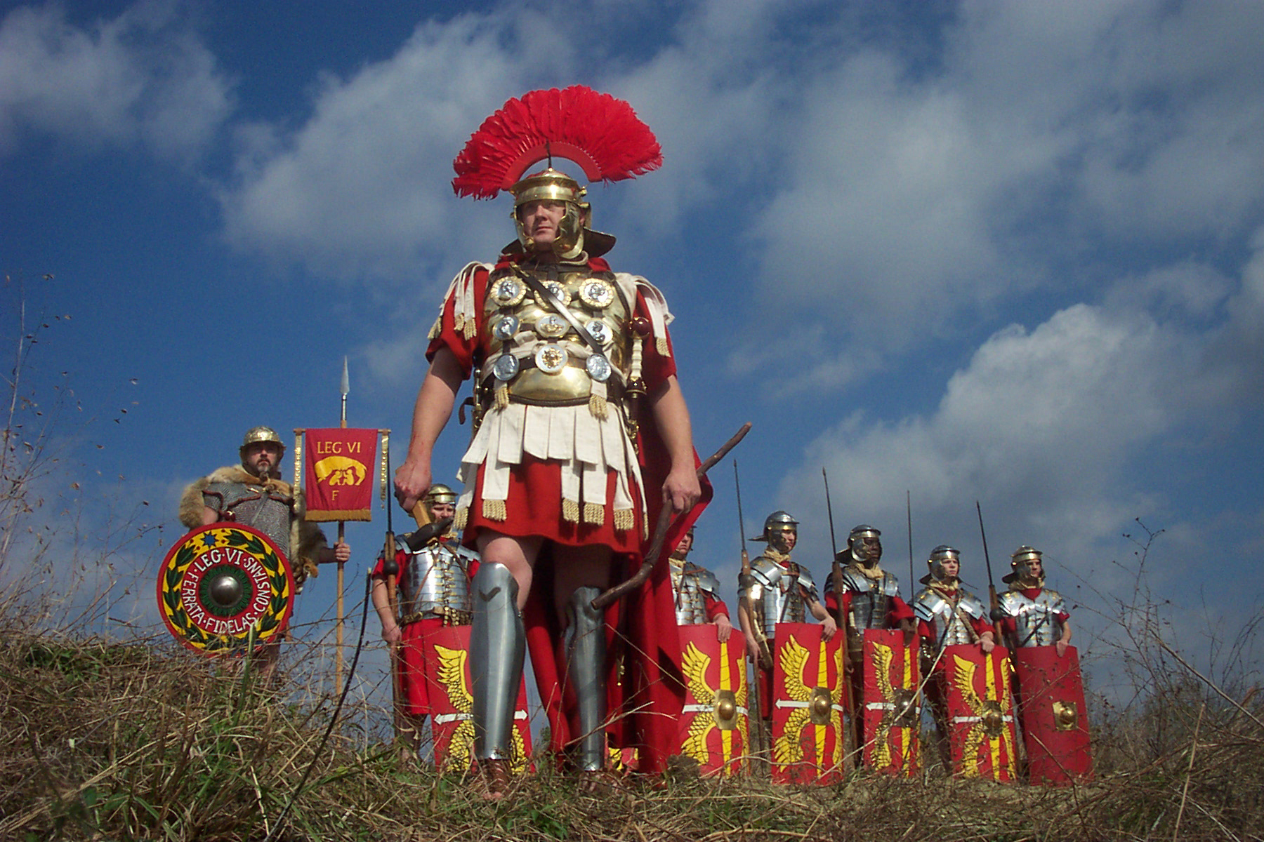
I really love the bright colours that are often found in military imagery, those being red, bronze, silver, black, and yellow.
The strong colours in their military, (particularly red and yellow), were used as a tactic to intimidate, and scare the enemy.
Note the Roman shields below in the images, as they combine the red and yellow, which is a very intimidating look in my opinion.
 |
| http://www.proprofs.com/quiz-school/upload/yuiupload/905476727.jpg < image reference at this link. |
 |
| http://www.primaryhomeworkhelp.co.uk/romans/images/soldiers/shield.jpg < image reference at this link. |
 |
| http://upload.wikimedia.org/wikipedia/commons/7/76/Romeinse_vlag.jpg < image reference at this link. |
The image below shows how bright colours can make design very appealing and attractive.
 |
| http://media.creativebloq.futurecdn.net/sites/creativebloq.com/files/images/2012/10/camdentownbrewery.jpg < image reference at this link. |
These colours included some of those used in the military, and also colours that were tied to certain class systems in ancient Rome.
 |
| Red |
 |
| "Bronze" |
 |
| Yellow |
 |
| Black |
 |
| "Silver" |
For example, the bolder colours/tones such as red, yellow, white, and black, allow for the central illustration to be at its most contrasted, providing a greater sense of definition.
The other tones, such as "bronze" and "silver", are less bold, and make the illustration less contrasted than that of the bolder tones.
I like most of these tones, as a lot of them have their own unique style with different characteristics.
I will say though, that I do think my least favourite tone is white/silver, as it just looks too bland in my opinion, and looks too minimalistic, and not as eye catching as, for instance, the red, or bronze background.
 |
| White/Silver is out. |
----------------------------------------------------------------------------------------------------------------------
Typography:
Wylam brewery have a logo, and this logo features a font that reminds me of the text that would be found on for example, a burlap sack, or an industrial crate.
| http://www.wylambrewery.co.uk/catalog/view/theme/wylam_brewery/img/age_logo.png < image reference at this link. |
 |
| There is so much choice, that I really must think what would work best with the design. |
I really want the typography to appeal to the market of the brewery, and I will look back at my initial research on the company to help refresh my mind, and hopefully come up with a viable style.
It is a style that must work well with my botanical theme, and I want it to be 'quirky', perhaps illustrative based, at least for the name of the brew.
I have an idea of having a very roman style of text, possibly in a loose times new roman style, as it was the style used on most scriptures back in ancient rome, and I covered this use of font in the past, through my year one visual culture.
 |
| http://comps.canstockphoto.com/can-stock-photo_csp6909346.jpg < image reference at this link. |
I am open to using a computerised font, as it would appear very clean if I did.
I will experiment with typography greatly in the actual production of concepts, which will begin very soon.
Thomas.
No comments:
Post a Comment