I have decided to work on my bottle label design first, before beginning work on my 'beer clips' so that my direction of focus is singular, and I stick to a plan.
 |
| A bottle can be my blank canvas. |
Over the past week or so, I have been producing a wealth of research into such areas as what the briefs state, the market of Wylam brewery, their ethos, their current product range, and Roman oriented research, due to the heavy influence it has on the product ethos.
With this, I now believe that it is the right time to start thinking about what my label concepts could visually appear like.
Obviously I want a design that both compliments the Roman theme, and due to Wylam having no in-house style, I have a lot of freedom with the appearance.
There are a multitude of different styles that I can go with for the design, for example, I could go with a highly colourful variety.
 |
| http://blogs.independent.co.uk/wp-content/uploads/2013/04/RebelBrewingCraft-Range-5.jpg < image reference at this link. |
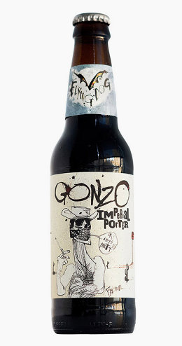
I could go for a very simple and contrasted line style, using black and white.
 |
| http://d.fastcompany.net/multisite_files/fastcompany/imagecache/inline-small/inline/2014/03/3028324-inline-i2-gonzo600.jpg < image reference at this link. |
Or a limited colour palette, featuring only a few colours. A very bold design.
 |
| http://editorial.designtaxi.com/news-packaging110214/8.jpg < image reference at this link. |
When looking at some of Wylam's existing style, I have noticed the lack of a digital artwork style, as part of their label designs.
 |
| https://barleyhopsblog.files.wordpress.com/2014/08/wpid-20140814_174424.jpg < image reference at this link. |
I will now look at some existing examples of alcoholic bottle labels, in order to see what the common styles are in the market.
 |
| Newcastle Brown Ale. |
 |
| Stella Artois Cidre. |
 |
| Bullmers Cider. |
 |
| Malvern Cider. |
 |
| Strongbow Dark Fruit. |
A lot of Wylam bottle labels feature a very traditional style of drawing, and this is a style which I really like, as I have always preferred traditional mediums to digital. I have a lot experience with pencil, but mainly with inks, in the form of pigment pens.
You can see some of my previous examples of work below.
 |
| Sketching onto tracing paper, to use for screen printing. |
 |
| Two-toned screen print of the last image. |
 |
| Ammonite with pen and pencil. |
 |
| A work in progress of a kitten. |
 |
| Work in progress of a crested gecko. |
 |
| A chick in an egg. |
 |
| A work in progress of a portrait. |
I feel as if this is a great opportunity to help re-inforce my own illustrative style, incorporating it into my bottle label design, and perhaps even my 'beer clips', as they must work together.
 |
| A 'beer clip' from the Tyne bar, promoting the Wylam brand. |
I want to try tying the design with the local area of Northumberland, so I will experiment with a way to do this over the course of my label concept creation.
Thomas.


No comments:
Post a Comment