
After thinking about what idea may be best to experiment more with, I now believe it is time to create some further concepts and designs that work with the use of typography, colour, and feature a level of professionalism found in more final designs.
At the end of this section I want to have a handful of design concepts, based on my chosen idea, of using a botanical theme for my bottle label.
 |
| http://thegraphicsfairy.com/wp-content/uploads/blogger/-bCGk4-cJ-9g/UAHISU7Yc-I/AAAAAAAASyM/UIzaYE7Jt2k/s1600/Botanical7-GraphicsFairysm.jpg < image reference at this link. |
I really do love illustrating in the field of natural forms, and if you have seen my personal work, you will be able to notice my passion for this.
I have sketched some rough images based around the theme of botanical formations, notably several focusing on the shape, and visual appearance of the caraway plant, which ties into the Wylam brief.


 |
| An extract from the Wylam brief, focusing on the caraway seed. |
 |
| http://blog.seattlepi.com/fremontoktoberfest/files/2012/09/beer-ingredients.jpg < image reference at this link. |
At the meet up, he brought in several bags containing the raw ingredients of beer, as well as a bag of caraway seed.
He brought in bags of hops, barley, and wheat, and although these plants don't look too stunning either in my opinion, I feel like they might all work together, maybe in a classical style, similar to the botanical illustrators that I have researching.
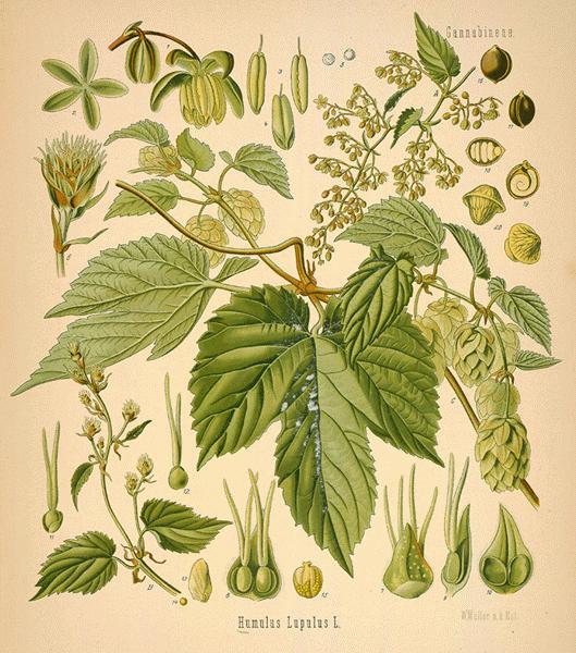 |
| http://www.botanical.com/botanical/mgmh/h/hops--32-l.jpg < image reference at this link. |
Hops:
 |
| http://www.newplanetbeer.com/wp-content/uploads/2011/07/hops1.jpg > image reference at this link. |
 |
| My personal section sketch of a hop plant. |
Barley:
 |
| http://fall11ethnobotany.providence.wikispaces.net/file/view/BarleyCommission-stock4.JPG/279948640/BarleyCommission-stock4.JPG < image reference at this link. |
 |
| My personal section sketch of a piece of barley. |
I also like the caraway seed border idea that I thought about earlier on, which I feel will help to split things up, and help provide segregation.
It could work in a similar style to the image below.
I will be experimenting with this route a lot over the next few blogs, and will be using this book to help me with my insight into botanical illustration.
Thomas.
It could work in a similar style to the image below.
| http://teacherclipartborders.com/wp-content/uploads/2012/09/Seeds-and-Distribution-Portrait-Blank.jpg < image reference at this link. |
Thomas.
No comments:
Post a Comment