I am now in my third concept stage, and within this stage, I will be taking some of my successful ideas and styles from the previous blog, and I will be working into them, making them more developed and refined, with a better direction.*
I have also been thinking more about routes that I would like my label concepts to do down, using my past research and experimentation as a guide.
I want something quite 'quirky', perhaps not just a generic image that 'is what it is'.
The story behind the 'Chara' brew, is
that during the Roman Empire, caraway seeds were blended with milk to form the 'Chara' of Julius Ceasar, eaten by the soldiers of Valerius as a battle booster".
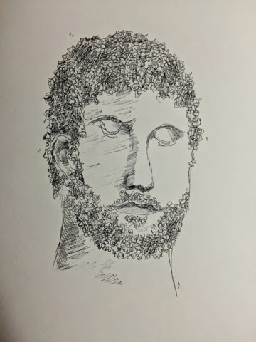
 |
Valerius
http://saints.sqpn.com/ncd05195.jpg < image reference at this link. |
Going off this description, I originally looked a lot into the military side of Roman history, as well as Rome's key figures, especially those who had an effect in the North East.
I have an idea that something along this theme could work well as part/all of the label, however I have a very open mind, and have been exploring multiple different themes.
Some Roman battle decorations that I came across at Segadunum Roman Fort, in Wallsend.
---------------------------------------------------------------------------------------------------------
Concept Idea #1:
 |
| I believe that Hadrian has a strong connection to the North. |
My first rough hypothetical concept idea uses the strong imagery of Emperor Hadrian as a large part of the label design.
I decided to use the imagery of Hadrian over the selection of other historical figures that I looked at in concept stage 2, because of his major influences in the North, as he allowed for the great wall dividing England and Scotland to be built. This wall is hence known as 'Hadrian's Wall'.
 |
| https://www.contours.co.uk/walking-holidays/maps/hadrians-wall-path-map.gif < image reference at this link. |
With Wylam brewery being located in Newcastle, (close to the wall), I figure that this concept relates to the product.
I got the idea for this concept, during label concept #2, which was all about experimenting with what could be done with the label design.
I have a feeling that this concept could work with colour, perhaps in Roman themed colours, such as red or yellow.
I will look more at the use of colour as part of the label, in the next concept blog, so please stay tuned.
 |
| http://www.timetrips.co.uk/rom-shieldreplica2.jpg < image reference at this link. |
 |
| https://www.coolcamping.co.uk/system/images/417/hadrian-s-wall-campsite-large.jpg < image reference at this link. |
 |
| How the illustration could work with the label size and shape. |
I really do like this concept, however I feel as if this illustration is a bit generic, so there is room to tweak the concept, and hopefully it may look more appealing for use on a label.
---------------------------------------------------------------------------------------------------------
Concept Idea #2:
 |
| The helmet is a strong reference to the Roman military. |
In my second rough concept, I have used the imagery of the Roman military, through my initial illustration of a Roman helmet.
 |
| Initial doodle idea found in concept blog number 2. |
Within this concept, I could also use the additional imagery of caraway seeds, which may act as a 'quirky' border.
 |
| http://teacherclipartborders.com/wp-content/uploads/2012/09/Seeds-and-Distribution-Portrait-Blank.jpg < image reference at this link. |
My border could be similar to the image above, however, changing the imagery to something that resembles caraway, (seeds, flowers).
The pen style is very rough, and I could see the background perhaps working with a very traditional Roman colour, which I feel would allow for the concept stand out.
 |
| How the illustration could work with the label size and shape. |
---------------------------------------------------------------------------------------------------------
Concept Idea #3:
 |
| My own illustration interpretation of a Caraway plant. |
For concept #3, I have looked at the Caraway plant, which is visually a very thin and delicate plant.
It is mentioned as part of the brief description, as the seeds of the Caraway were blended with milk to form the 'Chara' of Julius Ceaser, and was drank by the soldiers of Valerius.
 |
| http://upload.wikimedia.org/wikipedia/commons/4/42/Carum_carvi_-_Köhler–s_Medizinal-Pflanzen-172.jpg < image reference at his link. |
 |
| http://www.launc.tased.edu.au/online/sciences/agsci/essoil/caraway.jpg < image reference at this link. |
 |
| http://www.oilsandplants.com/pics/caraway2.jpg < image reference at this link. |
Above you can see examples of the Caraway plant, with its very thin, brush-like, and fragile appearance.
 |
| http://www.happyscrappinscrapbooking.com/mm5/graphics/jbs211.jpg < image reference at this link. |
For this concept I have illustrated my first interpretation of the plant, which could appear on the label design.
I used a very fine pen for this rough concept, as well as a good quality pencil.
It is a style that I really enjoy working in, and I think this traditional style may work well with the product, as I love Wylam's traditional looking labels, over the digital style.
 |
| How the illustration could work with the label size and shape. |
I like the fine level of detail, but I think in its current form, it may not work too well as a label. This is because the image looks quite bland, and very simple when shrunk down, as the detail cannot be seen easily from a distance.
I think I could tweak this concept to better suit the size of the label, perhaps by making another version of this illustration that features a smaller portion of the plant, zoomed in so that the detail can be seen better.
I could also go with a design that works with other plants, such as those that help make up beer.
As well as this, I could exaggerate the visual appearance of the caraway plant, to make the image more striking, and flamboyant.
It may also work well with the use of colour, as the caraway plant has very beautiful flowers, which I feel may be attractive being a part of the design.
They are small however, but zoomed in I could get fine levels of detail.
The existing illustration below, is a good example of how my refined illustration could look like, after I make a few amends.
It is a style that I think could work well, and I will be seeking to experiment with this.
 |
| https://blogger.googleusercontent.com/img/b/R29vZ2xl/AVvXsEg_LR24HTWSGU_oQDFAZs6oNjU8YEEAFAkKOyT_CS3Mg-vgAeccskTXHI92QZBLA7jr2Rix4nHum_FxNlKIpCSk0jlDdi-T2brHN0Z0ONYldXE2Xl4TnYRY8Tm-YE4w_LbiofU1QdTU6qo/s320/carawayseed.jpg < image reference at this link. |
In conjunction with the development of this concept, I have looked at the field of botanical illustration, to see other artist's examples, and to get a better insight in the best way to illustrate plants, if I choose to develop this idea into a proposed final.
One of the illustrators who I looked at is called Sally Pinhey, and the research can be found in a separate blog.
---------------------------------------------------------------------------------------------------------
Concept Idea #4:
My fourth concept uses some of my previous research on the Roman colosseum.
 |
| Some of my research on the Roman Colosseum. |
In the colosseum, many animals were used as part of the performances. The performances involved gladiators, slaves, or prisoners usually fighting to the death with wild animals such as Lions, Hippos, Tigers, and Wolves.
 |
| http://romancolosseum.yolasite.com/resources/gladiatorvslion.jpg < image reference at this link. |
With this in mind, I have opted to illustrate a rough concept illustration, featuring the image of a wolf, sketched using pen and pencil.
 |
| My rough wolf concept, as a work in progress. |
I based this illustration on a few initial doodle ideas, that I came up with in the second stage of concept development.
 |
| A Lion and a Wolf, the latter based off the mythological story of Romulus and Remus. |
 |
| A Lion |
 |
| A Bear. |
 |
| A Tiger. |
Like the other rough concepts, I placed the image of a Wolf, onto my very rough label template, which I am using as a very basic guide.
 |
| How the illustration could work with the label size and shape. |
---------------------------------------------------------------------------------------------------------
In the next concept stage, I will review my concept ideas featured in this section, tweaking the illustrations further to better adapt them for use on a label, and the most successful ones will be placed onto a more professional looking label template, that will be to the precise specifications of the Wylam label, including a bleed this time around.
I will also look at colour and typography, and will be trying to find the best ones to suit the label design.
 |
| http://upload.wikimedia.org/wikipedia/en/archive/2/20/20130624173205!Photoshop_CC_icon.png < image reference at this link. |
I will be using Adobe Photoshop to create my more polished label templates.
* I later found out that the label was portrait oriented, but these roughs still act as a guide.
Thomas.


 ---------------------------------------------------------------------------------------------------------


No comments:
Post a Comment