Friday 28 November 2014

Label Concept #7 (my concepts)

So far, I have looked into possible ideas of what my label could be, produced initial sketches, chosen a route, and researched the use of colour, dimensions, and typography.

I now want to move onto making some actual concepts to look at, and talk about, as well as experiment with what I have learnt over the module so far.

My concepts all revolve around the theme of botanical illustration, Roman culture, colour, typography, and relevance to the product.

Progression so far.
Concept 1:
In the first concept I have used my research into botanical illustration, the product, and also the research that I have based on colour and typography to come up with the first finished experimental concept.

Concept #1 without bleed.
The plants featured as part of the concept are related to the product.
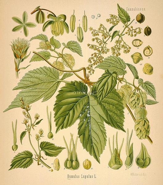
The plants featured on this label include the caraway, the hop, and the barley, which are all used in this particular brew.

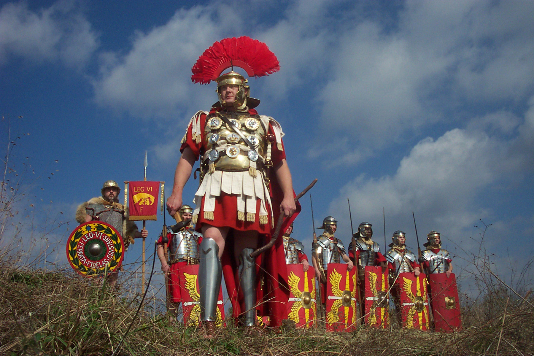
Using my research into colour I found that the tones of red, yellow, and black, (when working together), have a very Roman association in terms of appearance.
It resembles the style used in military wear, which these tones can be seen a lot on the shields for example.
My design features a lot of contrasting tones, with yellow on red, and vice versa.
This is to make the design appear bold.

The yellow border is a way to define the edge of the label, and makes it appear cleaner in my opinion.

http://www.personal.psu.edu/mow5058/squad.bmp < image reference at this link.
The colour is also brought through onto the typography, which the subject of typography is what I will discuss now.

The font is times new roman, which I had a look at in one of my earlier blogs, when I payed attention to roman styles of font.

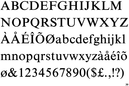
http://www.identifont.com/samples/monotype/TimesNewRomanSeven.gif < image reference at this link.
This font was used on a lot of scripts in ancient Rome, being found on monuments, statues etc.

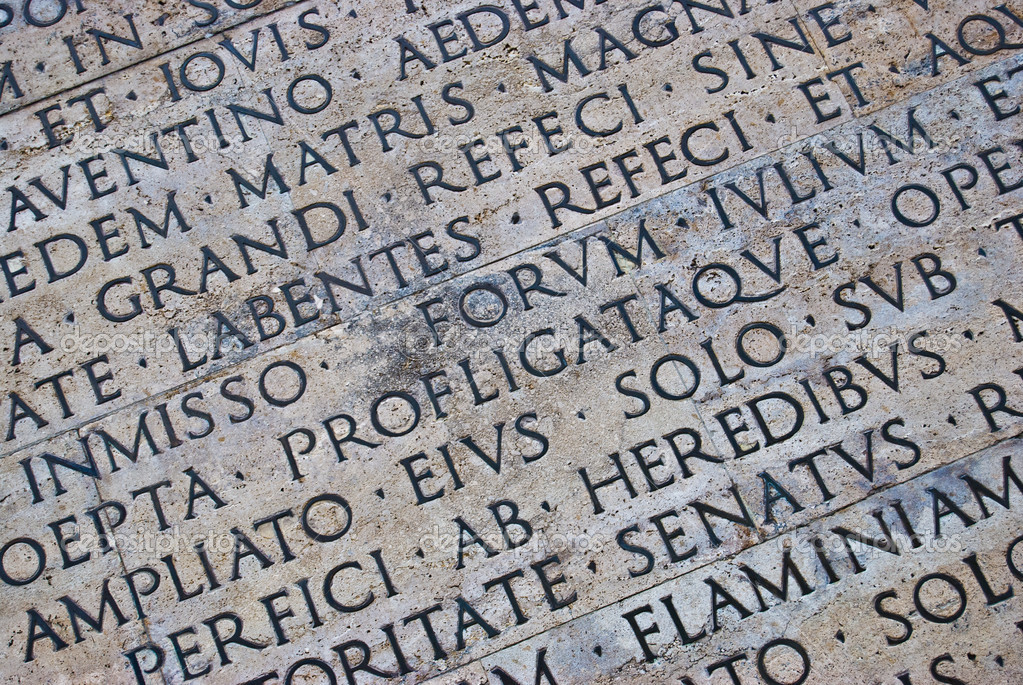
http://st.depositphotos.com/1015471/1938/i/950/depositphotos_19380543-Roman-scripture.jpg < image reference at this link.
This font is very easy to read, has a connection to the Roman culture, and is very bold.
It also suits the design very well in my opinion, so I am happy with the typography featured on this concept.

Update:
I showed this concept off in a group critique that I participated in on the 28/11/14, and it was pointed out by several students that the combination of both red and yellow could almost be considered Chinese, so to combat this I have toned down the red.
another thing that was pointed out, is that for a beer that is heavily influenced on the caraway seed, it is just a small part of the design, as the hop leaf is visually larger, and more dominant.

-------------------------------------------------------------------------------------------------------------------

Concept #2:

My second concept is an improvement of concept #1, and in this design I have made the caraway more of a dominant feature, instead of the hops.

I have also incorporated a sense of regional identity into this particular concept, and I have seen a connection to the flag of northumberland, and the research on Roman colours that I produced.

http://upload.wikimedia.org/wikipedia/commons/thumb/6/61/Flag_of_Northumberland.svg/2000px-Flag_of_Northumberland.svg.png < image reference at this link.
The original flag uses the colours of red and yellow, which works perfectly with the tones I want to work with.
I had to tone the level of the flag colours down, because they were very distracting toward the caraway illustration that is featured in the centre of the design.

The yellow of the flag has turned orange, due to clashing with the red background, as the opacity of the layer that contains the flag design was brought down from 100%, to 30%.

Concept #2 without bleed.
Like my first concept, the design uses the font, 'Times new Roman', as I strongly felt that it worked very well on the previous concept.

I really do like this concept overall, as I feel it has more to it than the previous concept. It also relates more to the local area, which is where Wylam's market is primarily based.
It is also more eye catching in my opinion, and gives the caraway seed, (which is a big influence on the brew), a higher level of importance, as in the previous concept the hop illustration overpowered the imagery of the caraway plant.

Concept #1's illustration focused more on the hop, than the caraway.


-------------------------------------------------------------------------------------------------------------------


Concept #3:

The other day I was in a local bar, as I went to buy a drink, I noticed some awful bottle labels which looked very cluttered, and very compacted.
This got me thinking about working in a simplistic style, as I tended to personally pay a lot more attention to the simple bottle labels.

With my third concept, I have stuck to my chosen theme of botanical illustration, and simplified the overall design, making the caraway again, a dominant feature on the label.
I have kept the font as it has been in my previous concepts, because I really do like this style, as it relates to the theme of the Romans, and also it is very clean, and legible.


The gradient from red, to burgundy offers a bit of a break in-between the colour, and compliments the illustrations featured on the front by showing that they are the bit that stands out.


-------------------------------------------------------------------------------------------------------------------


Concept #4:

In concept #4, I wanted to incorporate something alongside the theme of botanical illustration, in order to make the design relate more to the Romans.
I thought about previous ideas that I figured may work well, and I looked back at some of my research into animal imagery, looking at the colosseum in particular.

I initially thought about using a Lion, and so I created an illustration of a Lion bust, to be located in the centre of a label. I placed imagery of the caraway seed around the image to break the red background up, and I also used the official flag of Northumberland as well, which I think works very perfectly.


I kept the same Times New Roman font, however I discovered a texture tool, which gives the text a bit more of a Roman themed chiseled stone look.


Thomas.

Wednesday 26 November 2014

Label Concept #6 (colour & typography)

I have chosen my theme, which is based on the botanical idea that I coined in label concept #2, and now I want to look at such aspects as typography, and colour.

Colour:

Now that I have found a theme that I wish to work in, I want to focus on such elements as typography and use of colour.
http://www.bigbeadlittlebead.com/guides_and_information/Colour_Theory/01_BBLB_The_Colour_Wheel.jpg < image reference at this link.
I previously researched Roman colours earlier on in one of my blogs, and I want to work around this theme as it relates well to the brief, and the product.

I really love the bright colours that are often found in military imagery, those being red, bronze, silver, black, and yellow.

The strong colours in their military, (particularly red and yellow), were used as a tactic to intimidate, and scare the enemy.

Note the Roman shields below in the images, as they combine the red and yellow, which is a very intimidating look in my opinion.

http://www.proprofs.com/quiz-school/upload/yuiupload/905476727.jpg < image reference at this link.
http://www.primaryhomeworkhelp.co.uk/romans/images/soldiers/shield.jpg < image reference at this link.
http://upload.wikimedia.org/wikipedia/commons/7/76/Romeinse_vlag.jpg < image reference at this link.
I could see maybe a bright colour acting as a base for my illustrative label, and I will experiment with the use of colour.
The image below shows how bright colours can make design very appealing and attractive.

http://media.creativebloq.futurecdn.net/sites/creativebloq.com/files/images/2012/10/camdentownbrewery.jpg < image reference at this link.
In my first colour experiment, I tried placing one of my existing botanical illustrations, (barley), against several bright tones that are related to the Romans in some way.
These colours included some of those used in the military, and also colours that were tied to certain class systems in ancient Rome.

Red
"Bronze"
Yellow
Black
"Silver"
Each trial using a different colour effects the illustration in unique ways.
For example, the bolder colours/tones such as red, yellow, white, and black, allow for the central illustration to be at its most contrasted, providing a greater sense of definition.

The other tones, such as "bronze" and "silver", are less bold, and make the illustration less contrasted than that of the bolder tones.

I like most of these tones, as a lot of them have their own unique style with different characteristics.
I will say though, that I do think my least favourite tone is white/silver, as it just looks too bland in my opinion, and looks too minimalistic, and not as eye catching as, for instance, the red, or bronze background.

White/Silver is out.


----------------------------------------------------------------------------------------------------------------------

Typography:
Wylam brewery have a logo, and this logo features a font that reminds me of the text that would be found on for example, a burlap sack, or an industrial crate.

http://www.wylambrewery.co.uk/catalog/view/theme/wylam_brewery/img/age_logo.png < image reference at this link.
I have illustrated some font styles that came to mind, and although they are just rough basics, I am sure more ideas will come as I begin to 'break the ice' on this subject.

There is so much choice, that I really must think what would work best with the design.
Because the brewery has no house style, it means that I have a wide level of openness with how I show typography. This is great, as the more open a brief, the more creative I feel about it.

I really want the typography to appeal to the market of the brewery, and I will look back at my initial research on the company to help refresh my mind, and hopefully come up with a viable style.
It is a style that must work well with my botanical theme, and I want it to be 'quirky', perhaps illustrative based, at least for the name of the brew.

I have an idea of having a very roman style of text, possibly in a loose times new roman style, as it was the style used on most scriptures back in ancient rome, and I covered this use of font in the past, through my year one visual culture.

http://comps.canstockphoto.com/can-stock-photo_csp6909346.jpg < image reference at this link.
With this text, I could illustrate leaves or some other form of natural imagery, and it could possibly be eminating from the letters, however this is just an idea.

I am open to using a computerised font, as it would appear very clean if I did.

I will experiment with typography greatly in the actual production of concepts, which will begin very soon.


Thomas.

Tuesday 25 November 2014

Maria Sibylla Merian

Maria Sibylla Merian was an German-born naturist and nature illustrator.
She was often referred to as Anna Maria Sibylla.

http://upload.wikimedia.org/wikipedia/commons/0/05/Maria_Sibylla_Merian_portrait_from_500DM_banknote.png < image reference at this link.
She is known for her illustrations based on plant life, and insects. Her insect work focuses a lot on the transformation of insects, through the process of metamorphosis, and her work contributed to the advance of entomology, and credited to it greatly in the late 17th & 18th centuries.

http://upload.wikimedia.org/wikipedia/commons/9/92/Avicularia-avicularia.jpg < image reference at this link.
http://www.bandagedear.com/image/view/rosa-centrifolia-bullata-by-pierre-joseph-redoute-47545 < image reference at this link.
https://blogger.googleusercontent.com/img/b/R29vZ2xl/AVvXsEiU5KanfhENd0lnbx0QKY1AptXlUCtQsLLST-LSWBIZ4hNrBu9mHI6L5O8i0RAXW15ZTnaWIKYDqg3UlsFeF5eaI5phVIrOMXCiw8VI6BCoRAAKCSN9S0Oph7Wci3_Ka7SjDNhv7lEU9KaN/s1600/Merian-Maria-Sibylla-Three-tulips-Sun.jpg < image reference at this link.
http://www.discoveryeditions.com/images/data/FAR_PRODUCT/frame_image/37-1.JPG < image reference at this link.

http://artcove.co.uk/wp-content/greeting-cards/maria-sybilla-merian-pomegranate.jpg < image reference at this link.
https://www.theantiquarium.com/data/uploads/big-images/merian_roselle_1.jpg < image reference at this link.
http://www.wikigallery.org/paintings/261501-262000/261783/painting1.jpg < image reference at this link.

Above you can see some examples of her work, that includes her visual style.
they are very classical in style, one which I really love.

Interestingly, her father, Matthรคus Merian, was a renowned illustrator. after his death, she was raised by her mother and stepfather, Jacob Marrel, who was a still-life painter.
Merian studied painting at the family's Frankfurt home, and collected insects, as well as other specimens, including plants and fungi.
One of her favourite insects to collect, was caterpillars.


http://upload.wikimedia.org/wikipedia/commons/e/ee/Merian_Metamorphosis_LX.jpg < image reference at this link.
She began her own caterpillar collection, and witnessed them closely as they matured into butterflies.
She made remarkable gains in the field of the study of insects, and her illustrations were renowned for their level of detail, as well as their high quality.

http://womenswork.lindahall.org/pix/merian8.jpg < image reference at this link.
Note the very high level of detail found on one of her illustrations above.

She published the first volume of "Der Raupen wunderbare Verwandelung, und sonderbare Blumen-nahrung", translated as “Caterpillars, Their Wondrous Transformation and Peculiar Nourishment from Flowers”, in which the second volume appeared in 1683.
Both books featured in detail the process of metamorphosis, and focused on moths and butterflies.
She was highly credited for this, and she brought about a new standard of scientific illustration.

I am a big fan of her work, and I really think that my concepts will be influenced by her work, as well as the other botanical illustrators that I have research over the course of my research blogs.
http://www.briefmarken-bilder.de/brd-briefmarken-1987-bilder/maria-sibylla-merian-kuenstlerin.jpg < image reference at this link.


Thomas.


Shirley Sherwood

Shirley Shirwood, OBE, is a botanical illustrator based in the UK. She is heavily associated with Kew gardens.
http://www.newyorksocialdiary.com/legacy/i/partypictures/11_24_09/SSHerwood.jpg < image reference at this link.
She has been interested in both plants as well as art from a very early age, and she received her undergraduate degree in botany from Oxford university.

http://upload.wikimedia.org/wikipedia/commons/thumb/f/ff/Oxford-University-Circlet.svg/2000px-Oxford-University-Circlet.svg.png < image reference at this link.
Below I will provide examples of some of her stunningly detailed, colourful, and very beautiful work.

http://cdn.ltstatic.com/2008/April/HS521463_942long.jpg < image reference at this link.
http://www.culture24.org.uk/asset_arena/3/46/18/181643/v0_master.jpg < image reference at this link.
http://cdn.ltstatic.com/2008/April/MP136821_942long.jpg < image reference at this link.
http://www.ashmolean.org/ash/exhibitions/images/TreeFern.jpg < image reference at this link.
She started the Shirley Sherwood collection of contemporary botanical art in 1990, which now holds more than 850 painting and drawings, from a varied assortment of artists and illustrators.

http://www.kew.org/files/styles/content_featured/public/assets/KPPCONT_028415.jpg?itok=ZfSRHavX < image reference at this link.
Her family support the Royal Botanic Gardens, known as Kew, with the building of the Shirley Sherwood Gallery of Botanical Art.
The gallery was officially opened in 2008, by wildlife documenter, David Attenborough.


I really am a fan of her work, as it is very highly detailed and polished.
I will use her as a source of inspiration for my design, as well as the other botanical illustrators that I have researched so far.


References Used:
http://www.kew.org/visit-kew-gardens/explore/attractions/shirley-sherwood-gallery-botanical-art
http://uk.linkedin.com/pub/shirley-sherwood-obe-ma-oxon-d-phil/69/810/130


Thomas.

Label Concept #5 (botanical route)

So far in the development of my concepts, I have thought about initial ideas, and progressed upon them with each new stage.

After thinking about what idea may be best to experiment more with, I now believe it is time to create some further concepts and designs that work with the use of typography, colour, and feature a level of professionalism found in more final designs.

At the end of this section I want to have a handful of design concepts, based on my chosen idea, of using a botanical theme for my bottle label.

http://thegraphicsfairy.com/wp-content/uploads/blogger/-bCGk4-cJ-9g/UAHISU7Yc-I/AAAAAAAASyM/UIzaYE7Jt2k/s1600/Botanical7-GraphicsFairysm.jpg < image reference at this link.
I first thought about basing a design on a botanical theme in label concept #2, and have adapted my ideas.
I really do love illustrating in the field of natural forms, and if you have seen my personal work, you will be able to notice my passion for this.

I have sketched some rough images based around the theme of botanical formations, notably several focusing on the shape, and visual appearance of the caraway plant, which ties into the Wylam brief.


An extract from the Wylam brief, focusing on the caraway seed.
The caraway plant in my opinion isn't the most beautiful/attractive plant to come across, and I was thinking about backing up a potential design with other additional plants.

http://blog.seattlepi.com/fremontoktoberfest/files/2012/09/beer-ingredients.jpg < image reference at this link.
I remembered the meet up with Chris from Wylam brewery, which took place last Friday at the Tyne bar.
At the meet up, he brought in several bags containing the raw ingredients of beer, as well as a bag of caraway seed.

He brought in bags of hops, barley, and wheat, and although these plants don't look too stunning either in my opinion, I feel like they might all work together, maybe in a classical style, similar to the botanical illustrators that I have researching.

http://www.botanical.com/botanical/mgmh/h/hops--32-l.jpg < image reference at this link.
I really love the classical style found in the image above.

Hops:
http://www.newplanetbeer.com/wp-content/uploads/2011/07/hops1.jpg > image reference at this link.
My personal section sketch of a hop plant.

Barley:
http://fall11ethnobotany.providence.wikispaces.net/file/view/BarleyCommission-stock4.JPG/279948640/BarleyCommission-stock4.JPG < image reference at this link.
My personal section sketch of a piece of barley.

I also like the caraway seed border idea that I thought about earlier on, which I feel will help to split things up, and help provide segregation.
It could work in a similar style to the image below.

http://teacherclipartborders.com/wp-content/uploads/2012/09/Seeds-and-Distribution-Portrait-Blank.jpg < image reference at this link.
I will be experimenting with this route a lot over the next few blogs, and will be using this book to help me with my insight into botanical illustration.


Thomas.