Friday 26 December 2014

Communicating with the client

Now that my proposed designs are completed, I thought that it would be a good idea to contact the brewery, to see what they think of my designs.

Earlier on last month, I was given contact information to get in touch with Chris, a man who I met early in into the brief.


It is very important to have professional communications between yourself as an illustrator, and a client, who is basically the boss.
I briefly went over the topic of communication earlier on in a different blog in the module, and highlighted his importance.

http://stuartjallen.files.wordpress.com/2012/07/communication.png < image reference at this link.
I have established communications with other people/companies in the past, in relation to my practises, however this would be the first time establishing communications with a 'client'.

Below you can see my transcript that I have sent to the address above, and of course I will update the blog when I receive a reply.


Thomas.

Saturday 20 December 2014

Adobe Photoshop

Adobe Photoshop is an advanced software program.
It is a sold by Adobe, and the latest version is Photoshop CC, the CC stands for creative cloud, which is the primary version that I have been using for my commercial illustration module.


It is very commonly used in industry by many professionals ranging between artists, illustrators, and graphic designers.
As well as Photoshop, such other packages as Adobe Illustrator, Autodesk CAD, and Sketchbook Pro are used, sometimes in conjunction with Photoshop, as there is no one definitive package that offers all features.

It is a very powerful piece of software that allows the user to manipulate many different aspects of images, from basic things like cropping, sketching, and layering, to more advanced things, like editing colour via CYMK/RGB settings, and creating/printing 3d content.

I have been using Adobe Photoshop for a while now, and I have found my skill improving due continual use, especially over the past few modules.

Over the course of this module, I have been working a lot with Adobe photoshop, as I have done over a lot of my other studio modules.

Building a concept for the 'Font Clip'.
Adobe photoshop is a very useful tool for me as an illustrator, as it can enhance my designs.
All of my designs for this module have been created using Adobe Photoshop CC, which allows me to make industry standard designs at the correct dimensions as specified by Wylam.


Thomas.

Friday 19 December 2014

Summary of Designs (see updated message)

This module has been one of my favourite modules to date, as I feel as if it has really challenged me and my illustrative skill/voice, whilst giving me a taste of what it is like to develop something within the commercial space, as well as the academic space, which the latter I am very much used to.

For the Wylam brief, I was tasked to come up with the design for 3 different items, those being a bottle label, and two separate beer clips.

The first one that I set upon developing, was the beer bottle label, and in the end I came up with 3 finals to submit to Wylam.

http://www.lemontopcreative.com/wp-content/uploads/2013/05/Worsthorne_beer_bottles-1210x960.jpg < image reference at this link.

My final bottle designs can be seen below.

1st variant of the wraparound label.
2nd variant of the wraparound label.
3rd variant of the wraparound label.
I then moved onto developing the the 'beer clips', in which there was two different clips to develop.
Those being a 'clip' for the font, and a clip for the cask pump, to which examples can be found below in respectable order.

http://beerlens.com/wp-content/uploads/2011/02/IMG_5488-990.jpg < image reference at this link.

http://ebid.s3.amazonaws.com/upload_big/5/7/7/1400832657-3439-120.jpg < image reference at this link.
I wanted both of the clips to work together, as well as working with the bottle label.
I looked at my bottle labels, and thought about what I could do for the design of my clips.

After going through various stages of development, which I highlighted and recapped in the final clip development blog, I came up with the following two final designs, starting with the 'Font clips'.

Final #1
Final #2


Moving onto the 'cask pump clips' now, and my two finals can be found below.

Final #1
Final #2

With the final designs now ready for submission, they need to be digitally submitted at an industry standard.
I will be producing a blog all about the submission process soon, as it contains very important information.


-----------------------------------------------------------------------------------------------------------


Update:

I have recently found out that I can only submit one design per criteria, so that it remains fair to the other people participating in the same brief as me.
Because of this, I have selected 3 designs that I will be submitting to Wylam for the academic side.
When the time comes to submit commercially sometime later in the year, I will go ahead and submit the multiple choice designs that I originally intended to submit.

Final bottle label with bleed.
Final Cask Pump Clip with bleed.

Final Font Clip with bleed.

Note: The bleed is hard to see due to my black border, and adding guidelines would mean that it could be incorporated into the design.
The border is 1mm thicker to allow for cutting lenience.


Thomas.

Clip Concept #7 (final clips)

After a few weeks of development, I finally have my final 'beer clip' designs ready for submission.
Developing the clip took 7 stages, and a lot of research filled with concepts, and I want to briefly talk about each stage in development, so I can provide a recap.

I first began developing my clips, by going over initial ideas to do with the clip.

Initial ideas.

I then moved onto thinking about some initial ideas and concepts, as to what I could do with the clips, which helped in my preliminary development.

Possible Ideas.
The third stage involved working on my ideas coined in stage two, and was a key point in coming up with the final designs.

Working on my ideas so far.
The fourth stage in the development of my concepts, involved the actual assembly of my concepts, and was a vital stage in the development of my beer clips.


The fifth stage involved choosing one of my concepts that I created in the previous stage, to use as a base to use for my final clips.


The sixth stage highlighted the assembly of my final clips.


And finally, the seventh stage is where I am at now, highlighting my finals, and also going over how I got to the finals by briefly discussing my step by step development.

I want to now move onto discussing, and showcasing my final 'beer clips' now, and will start by showcasing my round 'Font Clips', afterward, I will be moving onto my rectangular 'Cask Pump Clips'.


'Font Clips':

The circular 'Font Clips' are the clips to be placed onto the font.

Final #1

This first 'Font Clip' uses the imagery of an Eagle, which is a creature commonly seen in Roman culture and mythology, for instance as part of the Roman insignia.
The yellow font works well against the deep red background, and the botanical imagery.


Final #2
This final is very much so like the one above, however instead of an eagle, the imagery in the center is that of a Lion, again an animal that is very commonly seen in Roman mythology, and culture, for instance the Colosseum.


'Cask Pump Clips':

The 'Cask Pump Clips' are the clips to be placed on the cask pump, and I have created two final variants for submission.
Final #1
The first final design situated above notably doesn't contain any theme of botanical illustration.
This is because as I was about to add the imagery, I felt as if this clip was bold enough, and adding more imagery onto the design may have made it seem cluttered.
Because I would be creating more final variants, it would be up to the brewery to decide which one worked best, and so I thought that I would give them an option.

Final #2
This clip contains both the imagery of botanical illustration, and of Roman animals such as the Eagle, (which you can see in the middle).
It is quite similar to the first final 'font clip' concept, but with aspects tweaked, notably focusing on the border areas of the design.
The font has also been tweaked to appear more bold, and contrasted against the deep red background.


Thomas.

Clip Concept #6 (assembling my final clips)

Now that I have chosen a concept to base my 'beer clips' on, I feel that I am ready enough to begin creating my final designs.

Like the bottle label, I want to produce several variants of the clip finals, in order to give Wylam a range of different designs to choose from.
This will offer me a higher chance of having my design selected for use on the actual product.

I will be using the elements that worked well on the concepts that I produced earlier, and discarding the elements that did not, in order to give me a refined, professional looking final design.
This is in a similar fashion to how I refined my previous bottle label concepts, and I found it to provide me with a good level of development, so because of this I have decided to stick with using this method, since it has been successful in the past.

As a recap, I decided to base my 'Font Clips' on concepts 3 & 4, and my 'Cask Pump Clips' on concepts 1 & 3, and visual extracts from the previous stage of development can be seen below.

Choosing my 'Font Concepts' in the previous stage of development.
Choosing my 'Cask Pump Concepts' in the previous stage of development.

Like the bottle label development, I will producing several finals of each clip to submit to Wylam Brewery, in order for me to have the best chance of success with the designs.

Below you can see some screenshots that I took during the final assembly process, and how I have taken inspiration from the concepts that I previously developed, notably concepts #1 and #3.

Working on a final variant of the rectangular 'Cask Pump Clip'.
You can see in this image, I am adding a border inspired by concept #3.
Working on the same final as the previous screenshot, you can see how I tweaked the colour of the Eagle illustration to match the similar style inspired by concept #1.
My first final 'Cask Pump Clip'.
You can see how I have taken various inspiration from these two concepts featured above, with the colour of the Eagle, and the border, as well as the dominant red colour scheme, and the boldness.

In the next stage I will be showcasing my final multiple clips in full.


Thomas

Thursday 18 December 2014

Clip Concept #5 (choosing a concept)

In the last blog post discussing the development of the Wylam 'beer clips', I began the creation of my initial concepts.
I feel as if with all of my concepts created, there is room for improvement and refinement, and also certain concepts stand out over others.

At the end of this blog post, I aim to choose a concept for each clip to use as a base for the finals.
This development route will be in a very similar fashion to how I previously developed my final bottle label.

I want to start by going over what I have developed so far, starting with my 'font clips'.

'Font Clips'


Concept #1

Concept #2


Concept #3

Concept #4


'Cask Pump Clips:


Concept #1


Concept #2


Concept #3


I like a lot of my designs, but some I prefer some over others.

I want to pick at least one design to base each final clip on.
I will start off by talking about which design to base my 'cask ale clip' on, which was the first set of concepts that I developed.

'Font Clips':

I really like these concepts, however my favourite ones that stand out to me, are concepts 3 & 4.


I like these designs, because they contain both the themes of botanical illustration, as well as the theme of Roman animals. Concepts 1 & 2, look good, but they look far too simple for my liking, and they don't contain as much details as my favourite ones.

I also like the use of the dominant colour of red, rather than yellow, as I feel it makes the design more bold.

These are the reasons as to why I have decided to base my final 'font clips' on designs 3 & 4.

'Cask Pump Clips':

Moving onto my 'Cask Pump Clips' now, and like the bottle label, and the 'Font Clips' I stuck with the running theme of red and yellow, as I wanted my designs to work together almost in a set.

I like all of my 'Cask Pump Clip' concepts, however I particularly like concepts 1 & 3, due to my usage of colour, and I really like the illustrations that I used on them, mainly my illustration of an Eagle, which is an animal that is commonly associated with the Roman military.
I decided to not include concept #2, because I was not fond of the borders used in the concept,  where as the borders used in concept 1 & 3 appear clean, more professional, and defining, in my opinion.


In the next stage I will be piecing together my final clips, using what I have developed within this blog, and all of my previous blogs.


Thomas.

Wednesday 17 December 2014

Clip Concept #4 (creating concepts)

Over the past few blog posts to do with the development of the beer clip, I have come up with a few ideas, and have put them into practise.

Blogs so far in exclusive development of the clip.
From all of my development so far, I feel both confident, and ready enough to begin creating clip concepts, and to streamline development, I will create concepts for both the 'cask pump clip', and the 'font clip', at the same time, going against what I said earlier on, where I was going to focus on only one at a time.

I will begin by showcasing my 'Font clips' first, and these can be seen immediately below.

Font Clips:

The font clip is the round variant of the 'beer clip'.

Concept #1:


Concept #1
Concept #1 is heavily based on the botanical theme that I have previously been looking into, and working with for the development of my bottle label.

The round clip features all of the necessary information needed to be featured on the clip, as stated by the official brief, and the clip concept also works with the similar colour scheme that was used for the bottle label.

I like this concept, it is simple, very eye catching, and works with my bottle label finals well, to act as a continuation of the design theme.

3rd variant of the wraparound label.

I do feel that more could be done to this concept however.
For example, I could use a caraway seed border as part of the design, which would not only make it more bold, but would allow more of a connection to my botanical theme, and how the product is linked to the caraway seed/plant.


------------------------------------------------------------------------------------------------------------------


Concept #2:


Concept #2
Concept #2 uses a similar design to the first concept, but it contains an entirely different theme.
This concept incorporates the theme of Roman animals into the design, notably the Lion due to the history of the colosseum, and how the Lion is a fierce animal, representing the Roman Army's power.

Like the concept above, this variant contains all of the necessary information needed to be featured on the clip, and although the image above is not to scale, the actual photoshop file is.

I would like to incorporate elements of botanical illustration into future concepts, for example, I have been thinking about using the botanical theme as part of the clip's border.


------------------------------------------------------------------------------------------------------------------


Concept #3:

With concept #3, I have used a much more heavier use of botanical illustration, and coupled it with the theme of the colosseum.
I have also inverted the colours, making the background, a more dominant tone of red.

In my opinion, I feel as if the caraway flowers that surround the lion in the centre, help to make the clip concept stand out a lot.

This concept uses two theme for the first time in my clip development so far, and without being too biased, I think so far, this design is the most appealing to me.


Concept #3

------------------------------------------------------------------------------------------------------------------


Concept #4:

Concept #4 is very similar to my third concept, however I have changed the original imagery of the Lion, to that of an Eagle.
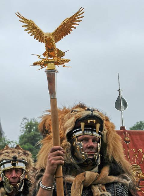
The Eagle was another well recognised animal that held a lot of symbolism in Ancient Rome, as it was often used as military insignia.
This could help tie in the soldiers of Valerius, as this theme is seen on the brief as part of the ethos behind the product.

http://www.bible-history.com/archaeology/rome/imperial-roman-eagle-aquila.jpg < image reference at this link.
Concept #4


Cask Pump Clips:

The 'Cask pump clip' is the larger, rectangular variant, to work alongside the round 'font' clip.
It is the bigger out of the two, and will be positioned higher, similar to the image below.

http://www1.clikpic.com/helen/images/Pump%20clips%20Web.jpg <  image reference at this link.


Concept #1:

This first 'cask pump clip' concept once again contains the running theme of red and yellow, as these are colours that are commonly associated with the Romans, especially within their military culture.
I also used these colours as a major part of my bottle label.


Concept #1

The first Clip concept features a theme of animals found in the Roman colosseum, for this concept variant, it is the imagery of the Lion.

http://i.ytimg.com/vi/e6SeUtlWHUk/hqdefault.jpg < image reference at this link.

This illustration is bold against the red background, and the typography is also bold.
I feel as if this design is clean, and very eye catching, which is what is needed in a clip, as it is usually the first thing you tend to see in a bar environment.


------------------------------------------------------------------------------------------------------------------


Concept #2:

Like the first concept, this design also uses the imagery of Roman animals.
Instead of a Lion, I wanted to use the imagery of an Eagle, (known to the Romans as an Aquilla), and there are several reasons behind this choice.

For starters, the Eagle is a common symbol used in Roman culture, most notably as part of the Roman Army's insignia, which an example of this can be seen below.

http://www.caerleon.net/history/army/aquilifer.jpg < image reference at this link.
Concept #2
I like my illustration in this concept, as I feel as if it is one of my strongest illustrations of a bird to date.

------------------------------------------------------------------------------------------------------------------

Concept #3:


Concept #3

This concept uses two different animals as part of the design, and also incorporates the botanical illustration theme onto the clip, as the clip has two caraway flowers toward the bottom of the design.

The two animals almost appear to be merged, which I think has a good effect to it, as the Eagle could perhaps symbolise speed, agility, and a good eye, whilst the Lion could symbolise powerful, and strong.

In the next level of clip development, I will be looking at basing my final clips on the concepts that I have produced within this blog post, seeing what works, and what does not.
This will form the basis for my finals, which I will begin to develop over the next few days.


Thomas.