In the last stage of my label development, I looked at my basic rough idea sketches from stage #2, and created more polished concepts from them, placing them onto a very basic label template, matching Wylam's official dimensions.
Below I will show my progress so far for each concept idea, so a clear indication of my development can be seen, and it will also act as a recap, keeping me on track.
The illustrations that you see on the basic draft templates below, aren't necessarily the final concepts, it is just an idea of what I could do, and all of the concepts are open to being changed and tweaked, something which I want to experiment with.
I expect that in the next concept stage, there will be noticeable tweaks to a lot of the concepts seen in this blog.
 |
| The illustrations featured on the templates, don't mean they are to be stuck with, they can be tweaked at anytime. |
Roman military theme:
 |
| Stage #2 (Rough sketch). |
 |
| Stage #3 (a more refined sketch of a Roman military helmet). |
 |
| Stage #3 (placing the concept onto a basic template). |
---------------------------------------------------------------------------------------------------------------------
Roman Figures:
In stage #2, I looked at the possibility of using historical key Roman figures as part of the bottle label design.
I looked at the possible use, of the following, as I found them to be some of the most influential.
- Marius
- Augustus
- Julius Ceaser
- Nero
- Hadrian
 |
| Stage #2 |
 |
| Stage #2 (rough sketches) |
 |
| Stage #3 (a more refined sketch, of Emperor Hadrian.) |
 |
| Stage #3 (placing the concept onto a basic template). |
Roman Animals:
In stage #2, I looked at the possibility of using the theme of animals as part of the bottle label design.
This was due to the colosseum, and mythology.
 |
| Stage #2 |
 |
| Stage #3 |
 |
| Stage #3 |
---------------------------------------------------------------------------------------------------------------------
Caraway:
Due to the Wylam brief discussing that the basis of the 'Chara' brew, is based on the theme of the caraway seed, I thought that it would be good to work with this theme, as one of my concepts.

 |
| Stage #2 |
 |
| Stage #3 |
 |
| Stage #3 |
In the next stage I will be tweaking the concept, as well as the other concepts that I mentioned in the previous blog.
I really do like this concept, and it is the one I feel like I am warming to the most, however this doesn't stop me from incorporating elements from other concepts into my design, no matter which route I choose to go down.
---------------------------------------------------------------------------------------------------------------------
Now that I have had a recap of what I have done so far with my label, I will move onto developing my ideas and concepts further.
I must begin to think about such aspects as colour, and typography, and I will look deep into these aspects soon, but for now I will provide a brief overview, which will include some research and ideas.
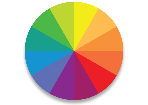 |
| http://www.designingfortheweb.co.uk/images/colour_wheel.png < image reference at this link. |
 |
| http://www.liquidbubble.com/wp-content/uploads/2014/06/typography-unnamed-cbffa-x-hd-jootix-66808.jpg < image reference at this link. |
I will first focus on typography, as it is a very important aspect, and could possibly be used with the illustration, as the images below highlight this example perfectly.
Typography is very important when it comes to the design of a lot of things, from products to advertising, etc.
It can help to enhance the meaning of a product, and the images below are perfect examples, and hopefully will provide a good understanding of this.
 |
| http://doublemesh.com/wp-content/uploads/2012/03/Heinz-Seriously-Good-Sauce-Print-3.jpg < image reference at this link. |
 |
| http://s2.favim.com/orig/33/illustration-plants-typography-Favim.com-266368.jpg < image reference at this link |
 |
| http://cupcakedesign.com/wp-content/uploads/2011/11/DSC00355-Gardener.jpg < image reference at this link. |
 |
| http://illustrationfriday.com/wp-content/uploads/2012/08/botanical_garden_05.jpeg < image reference at this link. |
I will now move onto the subject of colour, focusing on Roman colours.
Colour:
Colour is a big part when it comes to design, as it can be the difference between a product/item being successful on the market, and it being a failure.
 |
| http://media.creativebloq.futurecdn.net/sites/creativebloq.com/files/images/2013/08/logo-color-psychology-wheel.jpg < image reference at this link. |
The colour yellow is often tied with such moods and emotions as happiness, optimism, danger, and caution.
Think about the yellow of a bee or wasp, or the yellow of a hazard sign, and hopefully you will get an idea of what I am talking about.
 |
| http://cdn.images.express.co.uk/img/dynamic/1/590x/wasp-416968.jpg < image reference at this link. |
 |
| http://www.incolor-inc.com/assets/images/osha/danger/danger%20shock%20hazard.jpg < image reference at this link. |
For example, such neutral colours like browns and greens, were often used as a colour on civilian clothes and robes.
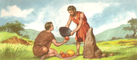 |
| http://www.daviddarling.info/images/peasants_exchanging_goods.jpg < image reference at this link. |
 |
| http://www.historyonthenet.com/files/fs/romans/images/togaman.jpg < image reference at this link. |
 |
| http://timesonline.typepad.com/.a/6a00d83451586c69e20148c86d3d89970c-320wi < image reference at this link. |
The strong colours (red and yellow), were used as a tactic to intimidate, and scare the enemy.
Note the Roman shields, as they combine the red and yellow, which is a very intimidating look in my opinion.
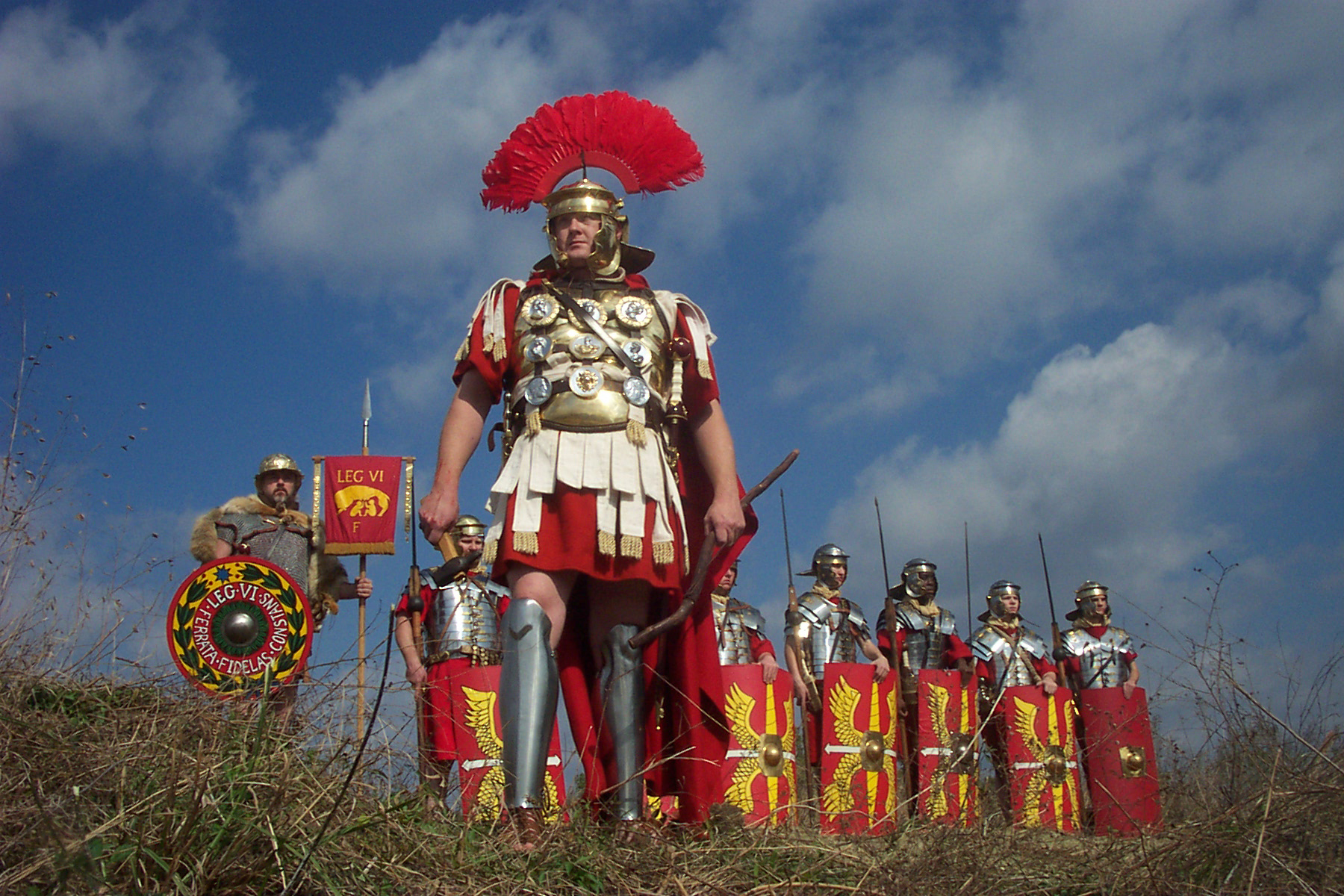 |
| http://www.proprofs.com/quiz-school/upload/yuiupload/905476727.jpg < image reference at this link. |
 |
| http://www.primaryhomeworkhelp.co.uk/romans/images/soldiers/shield.jpg < image reference at this link. |
 |
| http://upload.wikimedia.org/wikipedia/commons/7/76/Romeinse_vlag.jpg < image reference at this link. |
I would like to try going down the route of using such colours as the ones listed in this section of the research, those being notably red, yellow, bronze, black, and silver.
As of writing this blog, I really want to try experimenting with the idea of using an illustration of the caraway plant.
I love drawing nature, and I struggle when it comes to illustrating such things as the human form.
I feel that due to this, working with something that I feel confident with may be the best approach to go with for my future developments.
The other day when I was in Café Nero, I noticed a bottle sitting on the shelf above.
It was a syrup used as an ingredient in coffee, and the bottle had a very simple and gorgeous, colourful illustration/design featured on the label.
 |
| http://cafemoto.com/wp-content/uploads/2012/03/monin_bottles.jpg < image reference at this link. |
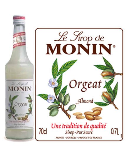 |
| http://yhc.ie/eng_pl_Monin-Syrup-Almond-700-ml-292_1.jpg < image reference at this link. |
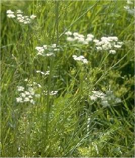 |
| http://www.gardensablaze.com/Caraway.jpg < image reference at this link. |
I will research additional illustrators who are creative in the botanical field to see their interpretation of working with the imagery of plants/nature.
I will also be experimenting with the use of colour, and working with the use of typography as well, and will provide additional research and exploration.
Thomas.


